Orene
BRANDING
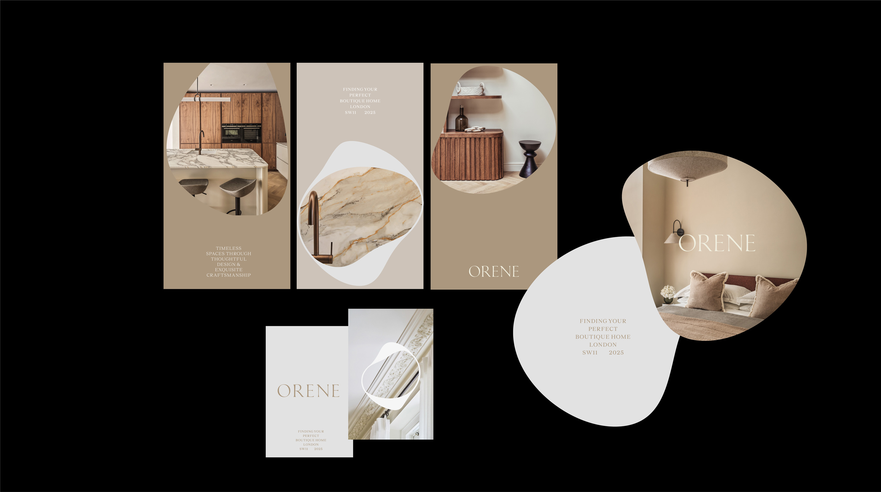
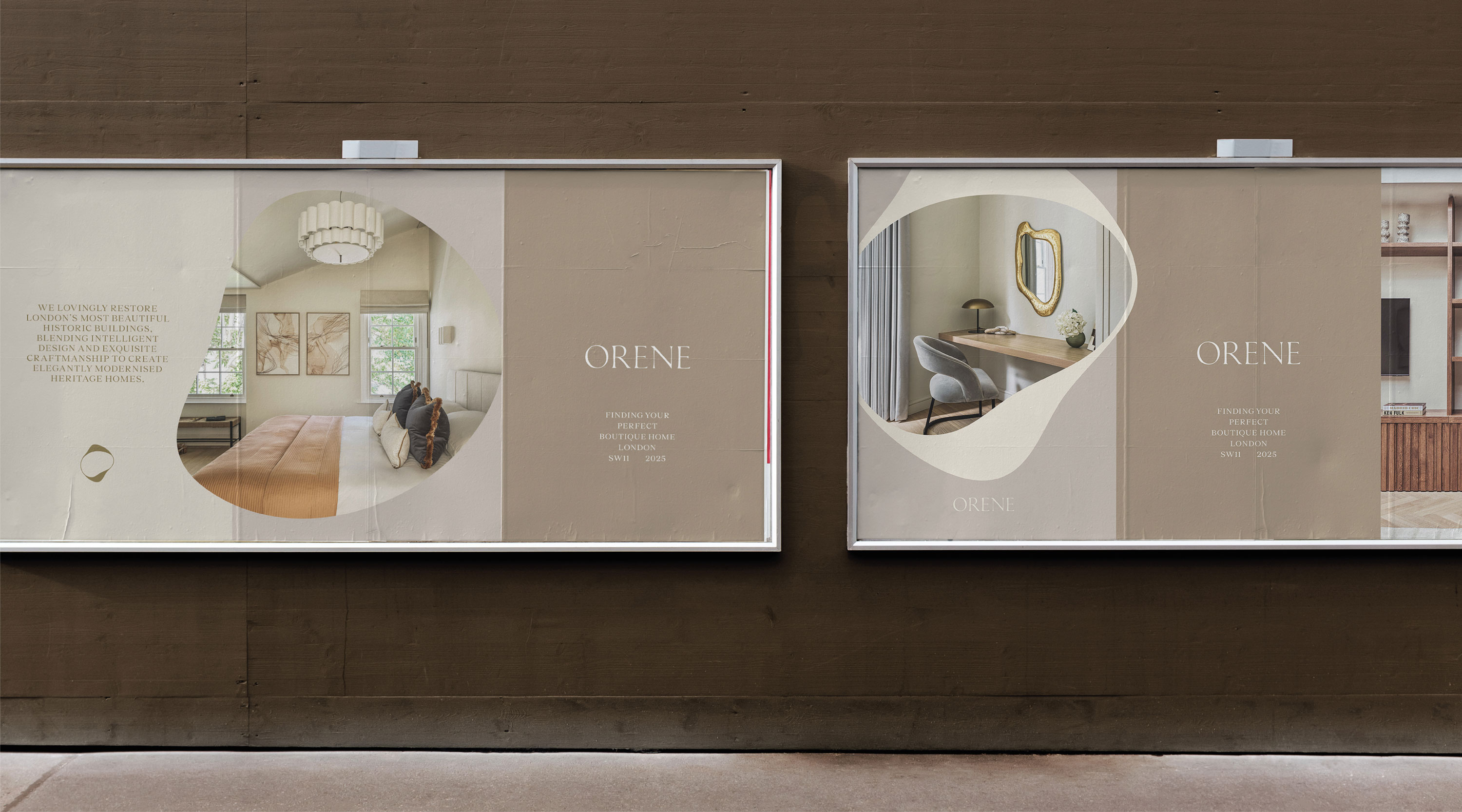
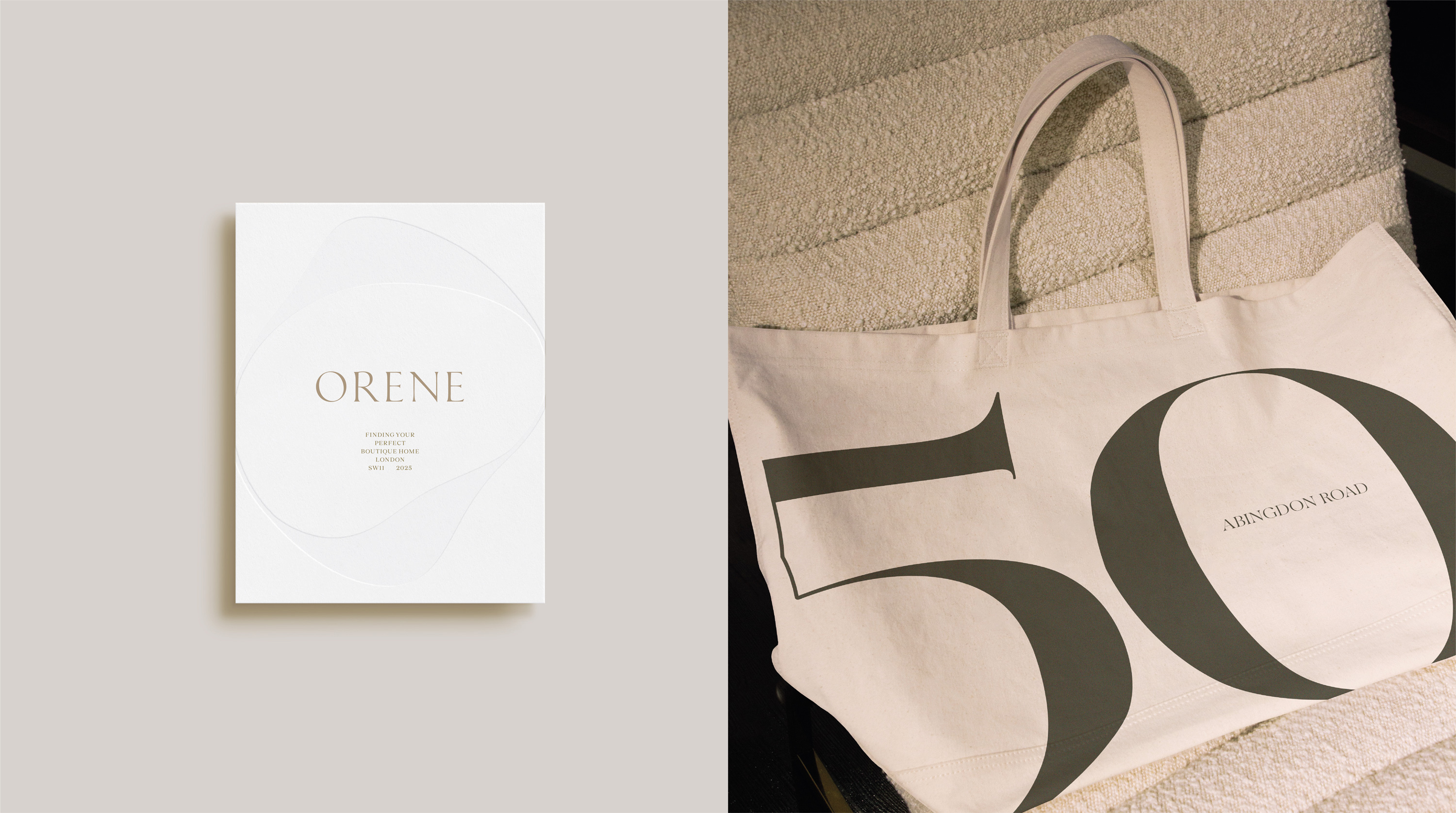
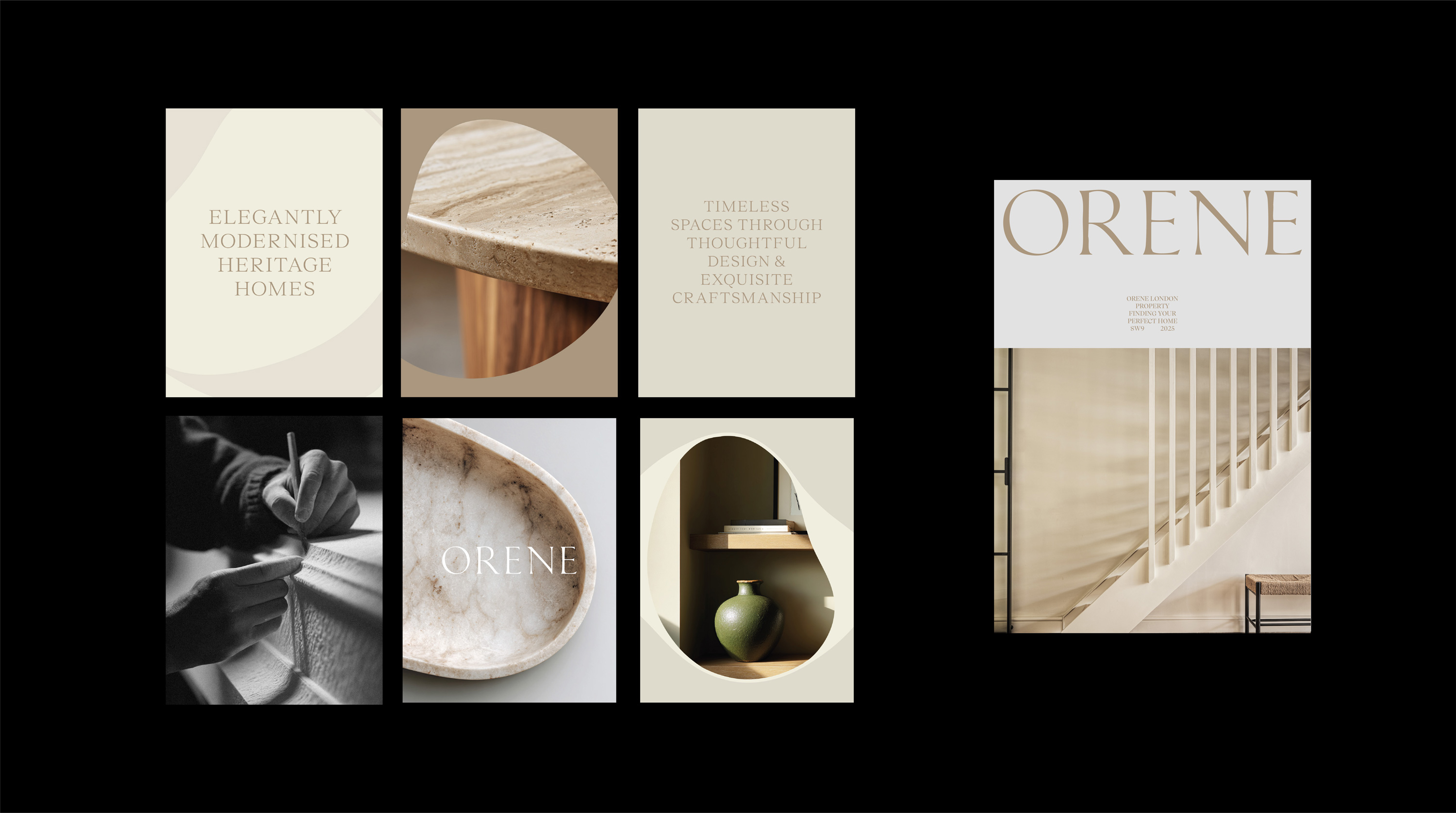
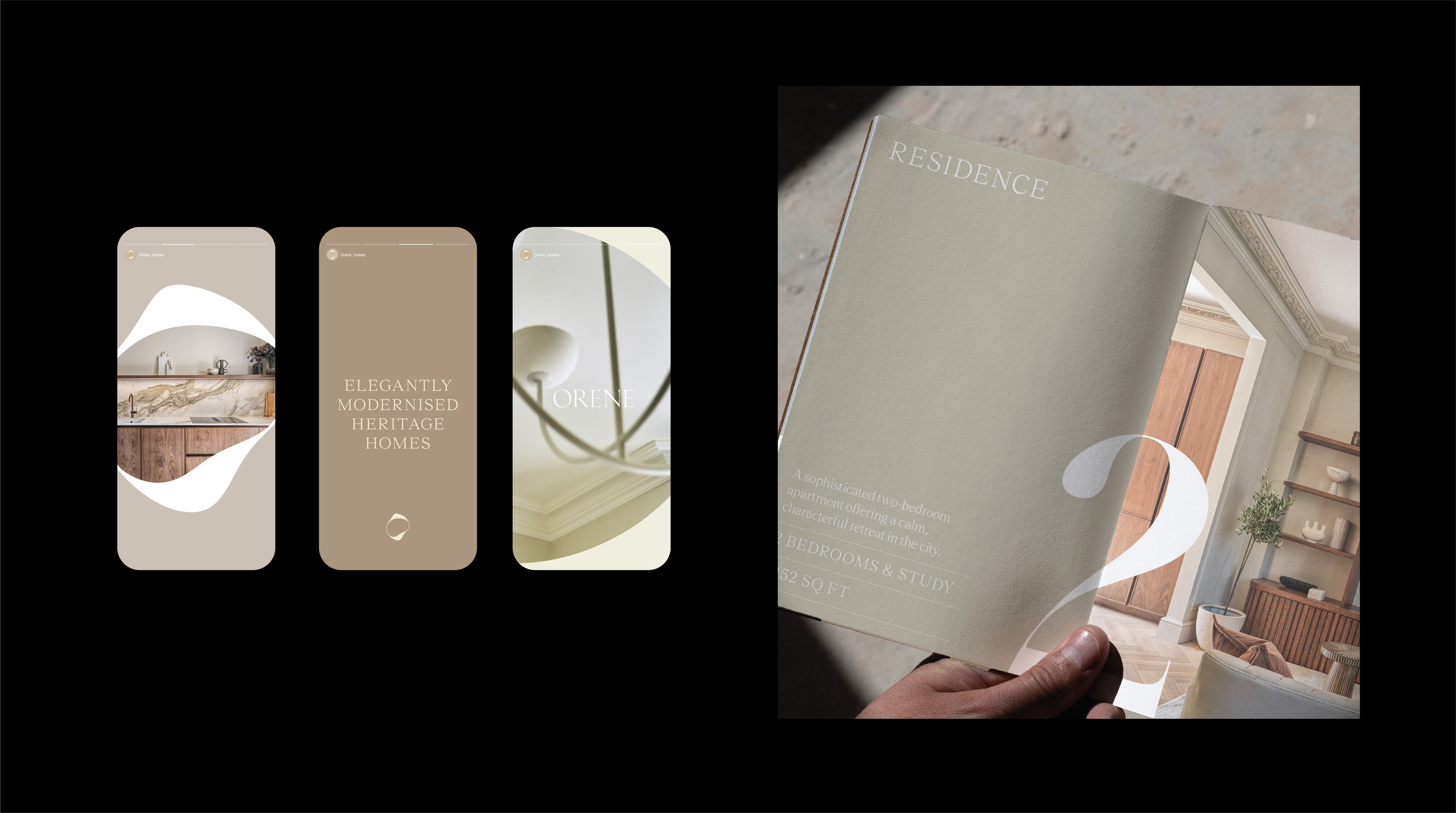
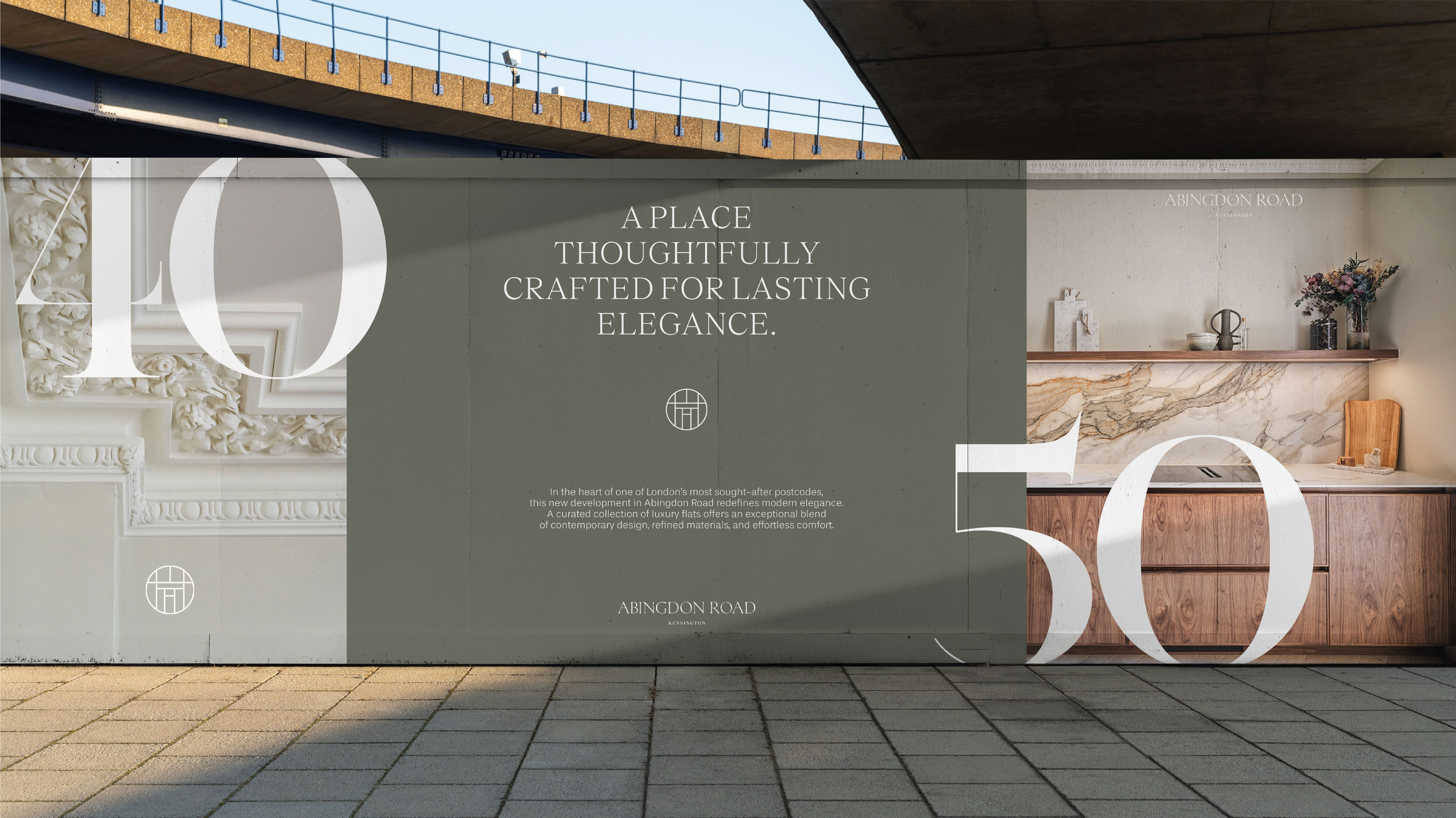
Orene is a London-based property developer whose visual identity is built around the dynamic ‘O’, a flexible graphic form that expresses the brand’s core belief that spaces evolve, adapt, and are shaped through craftsmanship. Paired with a refined, traditional wordmark, the ‘O’ symbol reflects the balance between bold contemporary design and meticulous attention to detail, positioning Orene as a developer that transforms spaces through intentional design and material excellence.
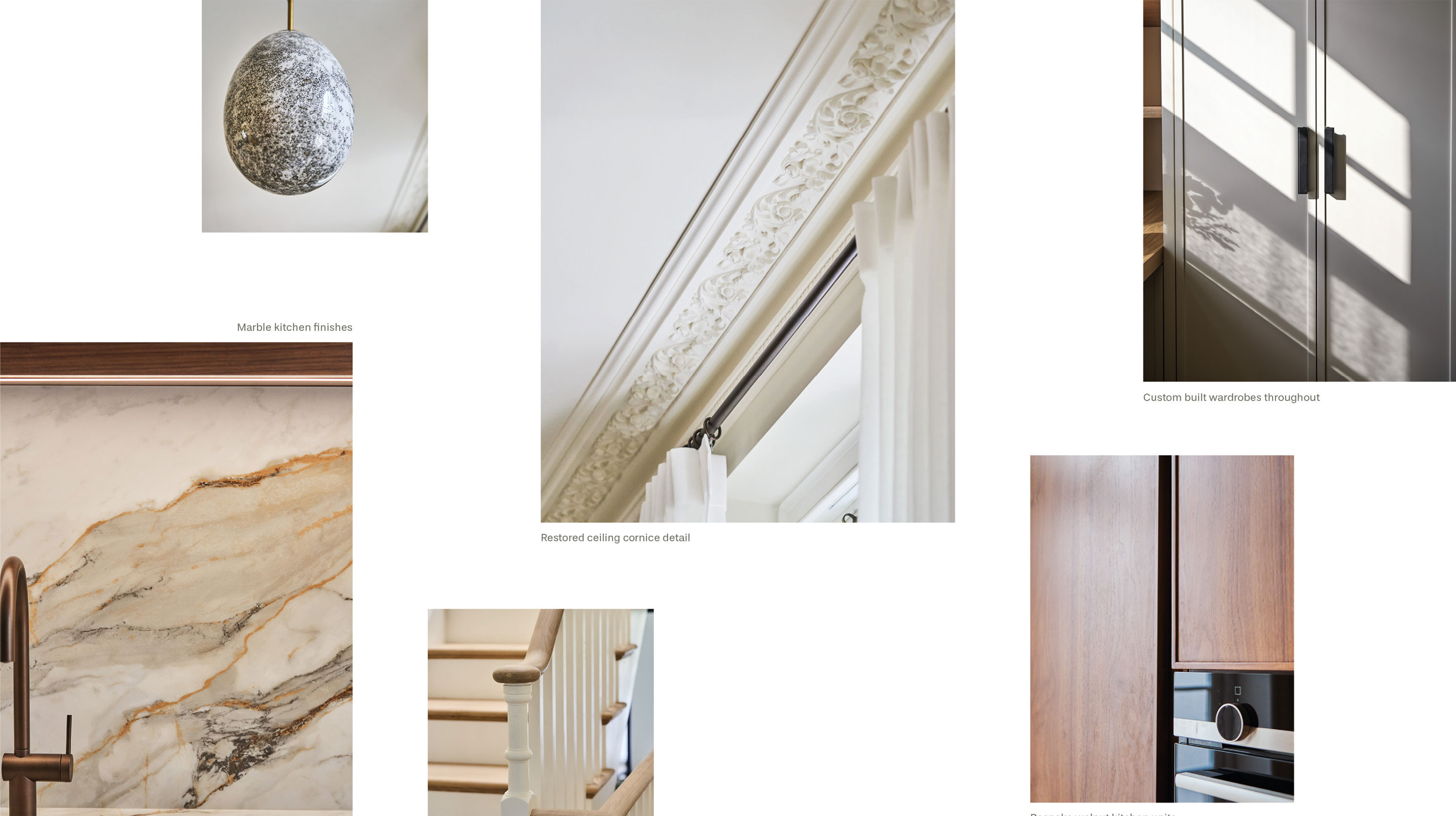
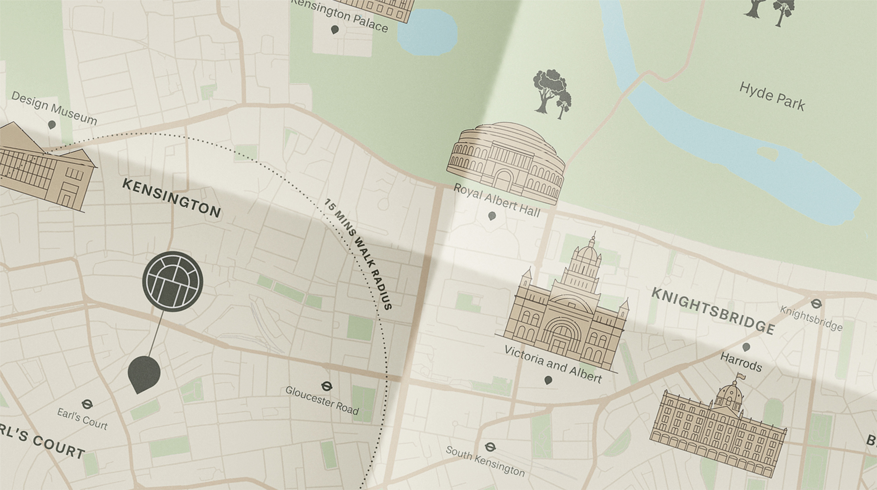
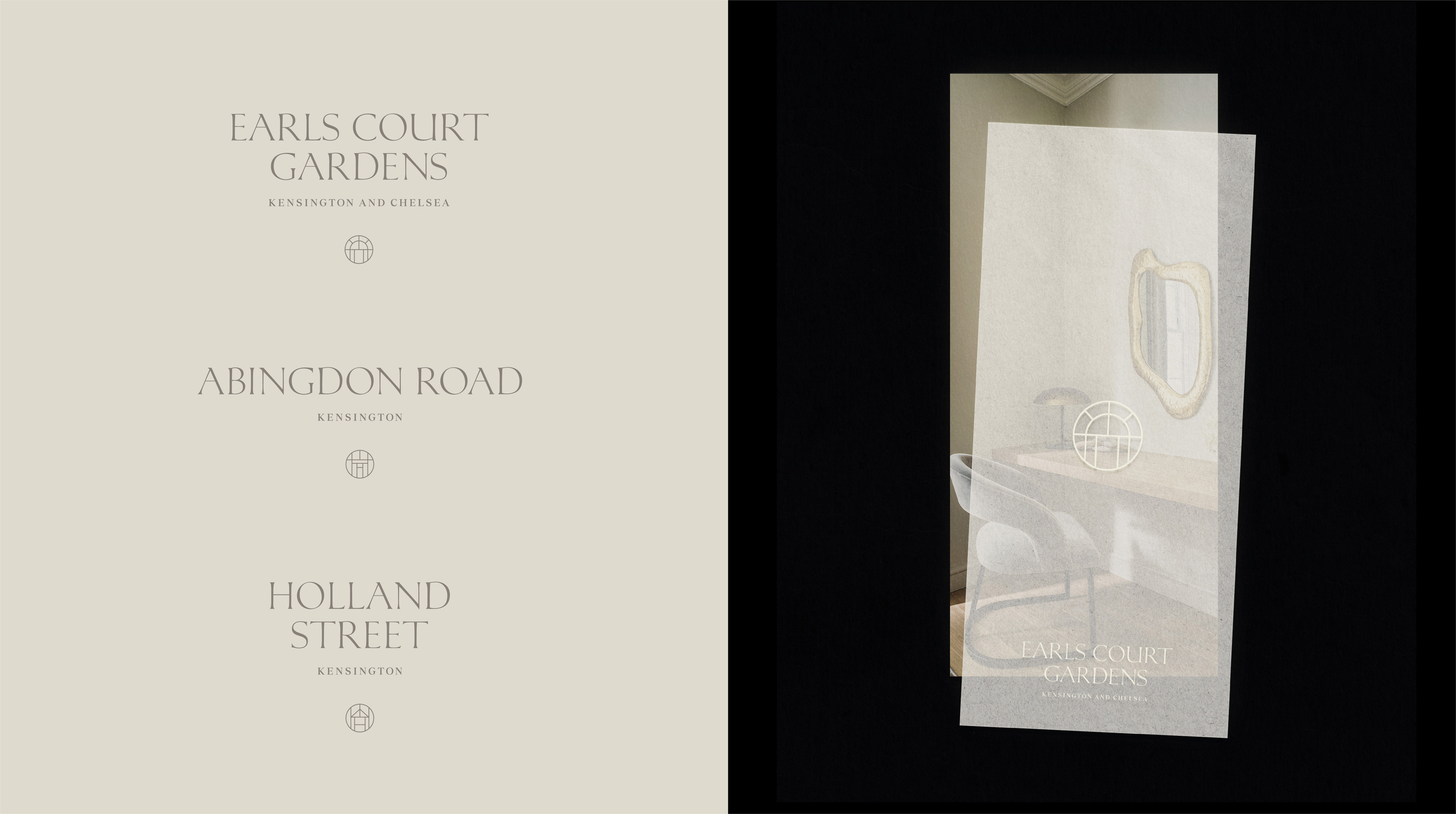
The identity system extends seamlessly into each of the developer’s individual projects. For every new development, a bespoke brand icon is created, drawn from a defining architectural feature unique to that building. This is complemented by a tailored colour palette, tonal direction, and a suite of marketing assets, forming a unified yet highly adaptable brand architecture.